
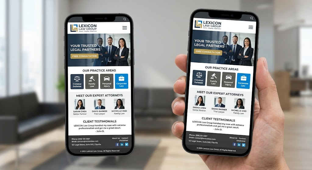
Law firm mobile website design comes down to one situation: a stressed person, standing somewhere inconvenient, holding a phone in one hand, trying to decide whether to call you. If your site works for that person, it works for almost everyone else. If it does not, the best copy and the best photos will not save it.
Most guides on this topic list the same items: a responsive layout, fast loading, and a call button. Those matter, but they do not tell you whether your site holds up in real life. This guide gives you a practical method called the Courthouse Hallway Test, plus practice area checks and a ten minute audit you can run today.
What Law Firm Mobile Website Design Really Means
A responsive site shrinks to fit a small screen. A site with strong law firm mobile website design goes further. It loads quickly on a weak connection, puts the next step within thumb reach, keeps forms short, and respects the fact that the visitor may be upset, distracted, or in a hurry.
Google also uses the mobile version of your pages when it decides how to index and rank them. A weak phone experience can cost you twice: once with visitors, and once in search.
The Courthouse Hallway Test
Imagine your visitor standing in a courthouse hallway. The signal is weak, the light is harsh, they are holding a coffee, and their hearing is in ten minutes. Test your site under these five conditions.
- One hand. Can you reach the main buttons with your thumb? Is the call button fixed in view, or buried in a menu?
- One bar of signal. Turn off WiFi and load the page on a weak connection. Does the first screen appear quickly, or does a heavy image hold everything up?
- Bright light. Take the phone outside. Is the text still readable? Low contrast gray text on a white background is the usual failure.
- Interruptions. Switch apps, lock the screen, and come back. Does the form keep what you typed? Does the page jump around while it loads?
- Stress. Ask someone who has never seen your site to find your phone number and your practice area within fifteen seconds while you watch. Wherever they hesitate is where the design fails.
Mobile Checks by Practice Area
Different clients reach your site in different moments. Adjust your pages for them.
- Criminal defense: visitors may be searching late at night. Put a phone number and a short statement about availability at the top, and explain first steps in plain language.
- Personal injury: visitors may be at a hospital or at the scene. Make the call button and a very short form the first things they see.
- Family law: visitors may be browsing privately. Avoid autoplay audio or video, keep the tone calm, and consider a quick exit link on pages for people who may be in unsafe situations.
- Estate planning and elder law: visitors are often older, or helping a parent. Use larger text, strong contrast, and plain labels on buttons.
- Immigration: visitors may prefer another language. Offer translated key pages with a visible language switch, and state clearly which languages your staff speaks on the phone.
- Employment law: visitors often browse during breaks. Keep pages easy to scan and forms short enough to finish in one sitting.
Tap Targets, Forms, and Click to Call
- Tap targets. Buttons and links should be large enough for a thumb, commonly about 44 to 48 pixels tall, with space between them so one tap does not hit two things.
- Click to call. Make every phone number a real tap to call link. Add a button that stays visible while scrolling, and track those taps so you know what the button produces.
- Short forms. Ask for name, phone, and a short message. Every extra field loses people. Use the phone keypad for phone fields and turn on autofill.
- Sensitive details. Tell visitors not to include confidential information in the form, and consider adding a note that submitting it does not create an attorney client relationship. Ask your ethics counsel for the exact wording.
- Pop ups. Full screen pop ups that cover content on a phone frustrate visitors and can hurt your search visibility. Use a small banner instead.
Speed on Mobile
Google’s Core Web Vitals give commonly used targets: the main content should appear within about 2.5 seconds, the page should respond to taps in under 200 milliseconds, and layout shift should stay under 0.1. You do not need to memorize the numbers. You need to remove what slows the page down.
Common culprits on law firm sites include:
- Oversized attorney photos and hero images.
- Autoplay video backgrounds.
- Chat widgets and several tracking scripts loading at once.
- Too many fonts and plugins.
Compress images, load video only when someone taps play, and keep only the scripts that earn their weight.
Readable and Usable for Everyone
Use body text of at least 16 pixels, allow pinch to zoom, keep strong contrast, and give buttons clear labels. These choices help older visitors, visitors with low vision, and anyone reading in bright light. They also support the accessibility goals many firms already hold.
A Ten Minute Mobile Audit You Can Run Today
- Open your homepage on a real phone with WiFi off.
- Count the seconds until you can read the first screen.
- Try to call the firm in two taps or fewer.
- Fill out your own contact form and confirm it arrives where it should.
- Turn the phone sideways and zoom in on text.
- Open your most important practice area page and look for anything that jumps, overlaps, or hides behind a banner.
- Run your key pages through Google’s PageSpeed Insights, mobile tab.
- Check the Core Web Vitals and mobile usability reports in Google Search Console.
If you would rather hand this work to a team that builds websites for attorneys, you can see how Elevate Web Designs approaches it at https://elevatewebdesigns.com/premium-law-firm-web-design-why-attorneys-nationwide-choose-elevate-web-designs/.
Q&A: Common Questions About Law Firm Mobile Website Design
What is law firm mobile website design?
It is the practice of planning a law firm’s website around how visitors use it on a phone: fast loading, easy tapping, short forms, readable text, and a clear way to call or message you.
Is a responsive website the same as a mobile friendly website?
Not always. A responsive site adjusts its layout to the screen size. A mobile friendly site also loads fast, has comfortable tap targets, readable text, and forms that work on a phone.
How fast should a law firm website load on a phone?
Aim for the main content to appear in about 2.5 seconds or less on a typical mobile connection. Faster is better, and the first screen matters most.
Should I add a click to call button?
Yes. Most visitors on a phone want to call, so a tap to call button in a fixed position removes friction. Track taps so you can see how many calls it generates.
Do I need a separate mobile site or app?
No. One responsive site that adapts to every screen is easier to maintain and avoids duplicate content problems.
Are pop ups a problem on mobile?
Full screen pop ups that block content can frustrate visitors and may hurt search visibility. A small banner, or a delayed message that is easy to close, is safer.
How do I test my law firm website on mobile?
Use a real phone first, then Google’s PageSpeed Insights and the mobile reports in Search Console. Ask someone unfamiliar with your site to find your phone number quickly.
Does mobile design affect search rankings?
It can. Google primarily uses the mobile version of a page for indexing and ranking, so missing content, slow loading, or a hard to use layout on a phone can limit how well the page performs.
The Bottom Line
Strong law firm mobile website design is not about shrinking a desktop site. It is about helping a worried person take the next step with one hand, a weak signal, and little patience. Run the Courthouse Hallway Test, fix the biggest friction first, and repeat the audit every quarter.